Skip to main content
Stopping Mosquito-Borne Disease
26 of 31
Case Study: Mosquito Eradication Program (Part 11)
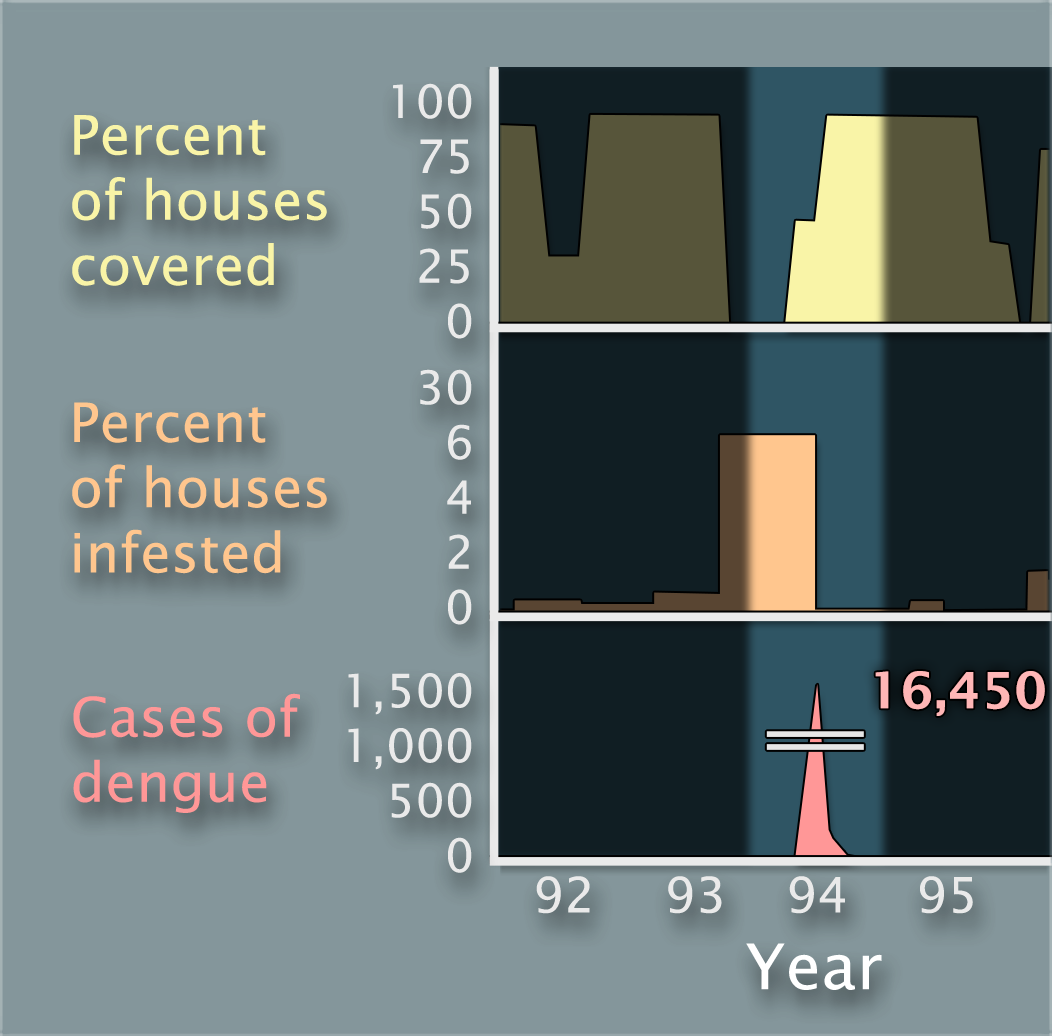
Now look carefully at all three graphs for the year 1994 and suggest an explanation.
Percentage of houses covered by mosquito interventions vs. percentage of houses infested with mosquitoes vs. cases of dengue in Fortaleza in 1994
Previous
1
2
3
4
5
6
7
8
9
10
11
12
13
14
15
16
17
18
19
20
21
22
23
24
25
26
27
28
29
30
31
Next
Supporting Information