Case Study: Mosquito Eradication Program (Part 6)

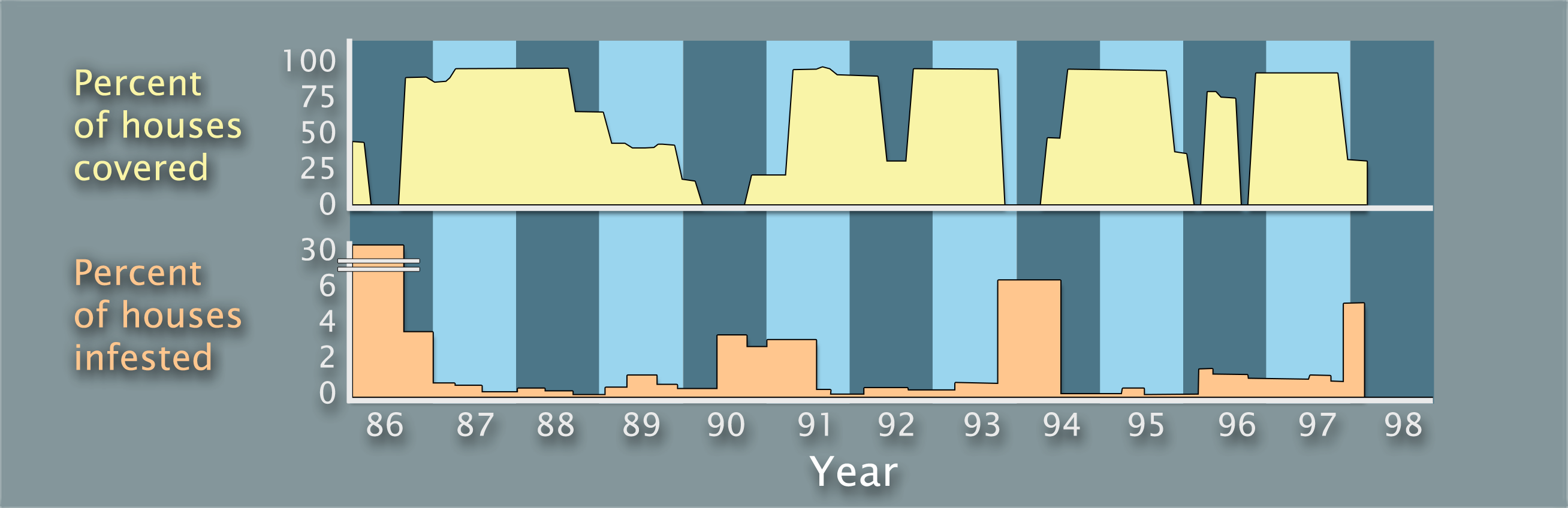
Time, money, and competing needs are the main reasons that coverage is not 100%. Now let’s compare the coverage and infestation graphs.

What stands out the most?

Two stacked graphs with the same x-axis, labeled Year and ranges from 1986 to 1998 in increments of 1 year. The top graph is titled Percent of houses covered and the bottom graph is titled Percent of houses infested, double as the y-axes. Mosquito interventions are shown in 1986, 1987 to 1990, 1990 to 1993, 1994 to 1995, 1996, and 1997 to 1998. Mosquito infestations are shown in 1986 to 1988, 1989 to 1991, 1992 to 1994, and 1996 to 1998.
Percentage of houses covered by mosquito interventions vs. percentage of houses infested with mosquitoes in Fortaleza from 1986 to 1998