Skip to main content
Stopping Mosquito-Borne Disease
23 of 31
Case Study: Mosquito Eradication Program (Part 8)
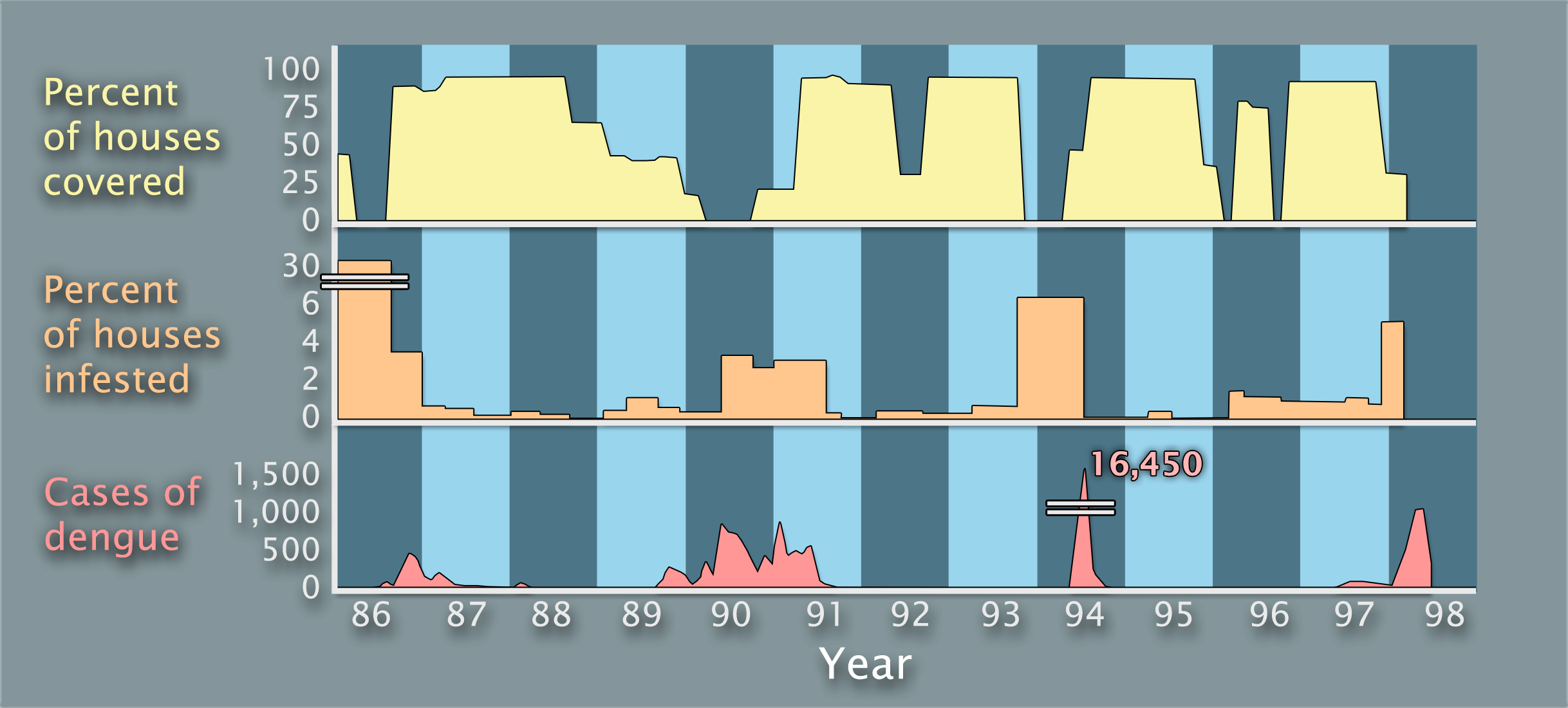
Comparing all three graphs, what correlations do you see?
Percentage of houses covered by mosquito interventions vs. percentage of houses infested with mosquitoes vs. cases of dengue in Fortaleza from 1986 to 1998
Previous
1
2
3
4
5
6
7
8
9
10
11
12
13
14
15
16
17
18
19
20
21
22
23
24
25
26
27
28
29
30
31
Next
Supporting Information